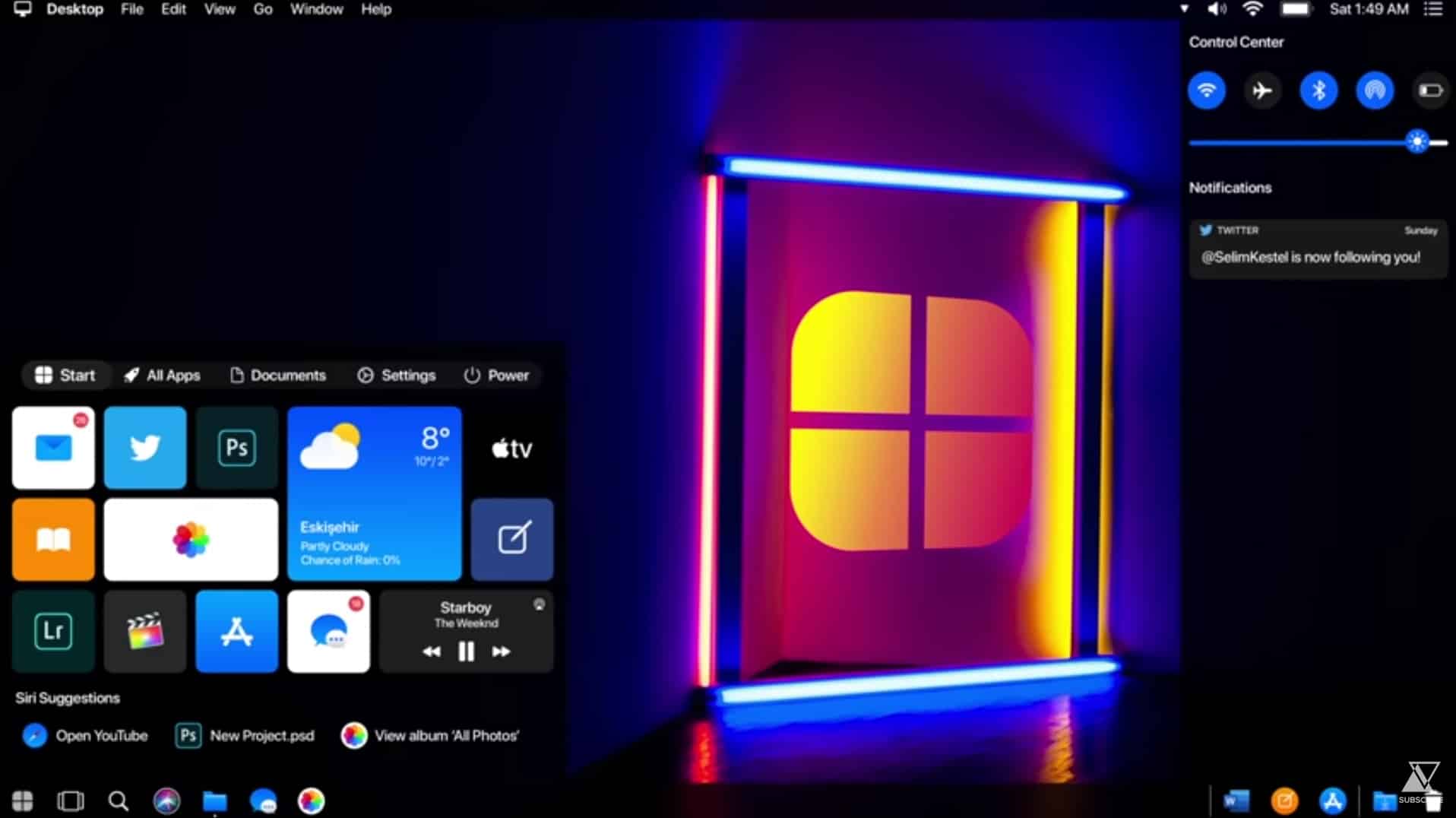
Sorry Microsoft, Apple's Windows 10 is the operating system we really want!

Apple has a reputation for producing stylish and elegantly designed hardware and software products. Microsoft, well, not so much.
Windows 10 under Microsoft’s control isn’t a bad looking operating system, but even after all these years it still doesn’t feel quite finished, with elements of the old design cropping up in various places. If you’ve ever wondered what Windows 10 would look like if Apple was developing it, we have the answer.
SEE ALSO:
- Windows XP 2019 Edition is the operating system Microsoft should be making [repost]
- Forget buggy Windows 10, Windows 11 is the operating system for us
- Windows 10 -- 1990s edition is the retro operating system we want
Serial concept creator Kamer Kaan Avdan, who has previously released videos for updated versions of Windows 95, Windows XP, Windows 7, Windows 11 and macOS 11 Ventura, today turns his attention to showing how Windows 10 might look if it was in the hands of Apple rather than Microsoft.
As you might expect, the result is a stylish, if slightly Frankenstein blend of Windows and macOS. The Start menu tiles take a little getting used to, as does the Menu Bar at the top of the desktop.
Avdan’s redesigned File Explorer includes some new options in Quick Access -- AirDrop and iCloud. There’s iMessage for Windows, and of course Safari takes the place of Edge.
The Action Center has been redesigned and gains Control Center icons above the notifications.
As you would expect from Apple, there’s a stylish dark mode and dynamic wallpapers, and you can unlock your PC using an iPhone.
Search has been redesigned too -- no need for Bing or Edge here!
What do you think of this Windows 10 concept? Do you prefer the Apple version to Microsoft's? Let me know in the comments below.