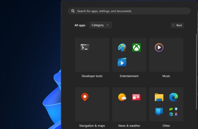
Microsoft is testing a change to the Windows 11 Start menu that you might actually like

With the Start menu being at the heart of Windows, it is vital that it functions in a way that makes sense to people. Sadly, this has not always been the case.
Over years of development, Microsoft has taken a series of questionable design decision with this iconic part of the operating system, but a change that could prove popular is about to land in Windows 11.
See also:
- Microsoft releases the new Outlook for Windows for anyone who wants it, including commercial customers
- OpenAI is developing a tool that can reveal whether text has been created by AI
- Security firm warns that 'design weaknesses' in Windows Smart App Control mean it can be easily bypassed
Since its debut in Windows 95, the Start menu has evolved -- or maybe devolved -- from something that was revolutionary, useful and highly customizable into a component that feels impersonal and contains unwanted elements such as ads. If you're signed up as a Windows Insider, you have access to an interesting change that Microsoft is working on.
A new option to view shortcuts you have installed organized by category is available in the latest beta build of Windows 11. The new view groups together shortcuts for similar or related apps, so all of your music apps are together, all of your entertainments, and so on.
It sounds like a minor change on paper, but it's one that could have a dramatic impact on how you use the Start menu; it could even lure back those who have shied away from using it because of awkward navigation and design. It is a new view which, as Windows Latest notes, complements the grid view nicely.
While Microsoft is yet to say anything about when this Start menu change will move from the beta channel and become available to everyone, it is reasonable to assume that the company will be looking to make it a part of the Windows 11 24H2 update later this year.
Image credit: Windows Latest